
Page 40 - IJPS-10-2
P. 40
International Journal of
Population Studies Design and usability evaluations of a course
that the instructions were easy to follow. They appreciated (“Good”), while two rated it as 6 (“Excellent”).
the combination of theory and practice but suggested some
changes to the graphical design to increase readability. 3.1.3. Direct observations
Changes included breaking up large text chunks into several During one of the practical exercises (“Daylight
paragraphs, using more subheadings in the introductory measurement using the mobile phone”), it was noted that
module, using bullet lists, and adjusting some of the headings the experts did not switch off the electric lighting when
(e.g., “Sleep” was changed to “Sleep in later life”). testing the downloaded light meter application.
The interviews revealed a number of usability issues 3.2. Round 2 with target users
(e.g., difficult or inconsistent terms, unclear instructions).
The most frequent conflict with the ten guiding principles 3.2.1. Usability testing interviews
for user interface design was “#2 Match between system and All six participants gave neutral-to-positive feedback
the real world” (e.g., word choice and the use of technical regarding the course (“easy to manage and read”, “good
terms), followed by “#10 Help and documentation” readability/…/but the first three modules were more
(e.g., unclear instruction for one of the quizzes), “#8 technical”, “very interesting”, “neither too difficult nor easy”).
Aesthetic and minimalist design” (e.g., unnecessary All of them found the instructions for the assignments easy to
repetition of information on quiz pages), “#4 Consistency follow. Participants appreciated learning things grounded in
and standards” (e.g., inconsistent use of “buttons” and research in an easily accessible way, guidance for practicing
“text links”), and finally, “#5 Error prevention” (e.g., error the acquired knowledge, the tips for further readings, and
messages when taking multiple-choice quizzes). the links between factual information to practical exercises.
One issue was not possible to solve because the clock The number of usability issues identified in the interview
display is a feature included in the learning management. data was significantly lower than in round 1. Issues in round
A clock display ticks when taking a quiz, which can be 2 included occasional incomplete instructions and text-
annoying when there is no time limit. A summary of the heavy pages. While some participants found the sections
types of issues, examples, and the adjustments after round about the technical properties of lamps and lighting useful,
1 is described in Table 2. two expressed that they were less interested in the subject
but still found them relevant. A summary of the types of
3.1.2. Usability testing questionnaire (SUS) issues regarding one of the pre-determined main categories
The individual experts scored 75, 75, and 85, indicating – “Perceived ease of use” – is described in Table 3. Three sub-
sufficient usability but room for improvement. Concerning categories were identified reflecting three aspects of design
the overall user-friendliness, one expert rated it as 5 (originally developed for the design of websites by Söderström,
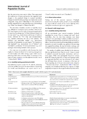
Table 2. Main issues with examples identified in round 1 with the experts (N=3) and adjustments
Category Examples of issues Adjustments
#2 Match between • Choice of words and the use of difficult technical terms • Replaced certain words with more commonly used words,
system and the real further explained technical terms (e.g., circadian, chronotype,
world lux), removed too technical terms (suprachiasmatic nucleus)
#4 Consistency and • Inconsistency when using “buttons” and “text links” • Consistently used “buttons” and text links in written
standards • Missing acronym “pdf” in the link text, which provides instructions
direct access to an external PDF upon clicking • Included the title of the document and “pdf” in parentheses
in the link text or the link to internal-only PDF
#5 Error prevention • Error message when not ticking any of the response • Added a response option (“Not applicable”) that can be ticked
options in multiple-choice questions when other options are not relevant
#8 Aesthetic and • Repetition of information on quiz pages • Reformatted the quizzes
minimalist design • Repeated image description explaining image • Shortened the image descriptions
content in the body text (detected when using the
speech-to-text software).
#10 Help and • A bit unclear instruction in one of the quizzes • Clarified the quiz instructions to increase comprehension
documentation • Confusion arising from not understanding the purpose • Explained the purpose of the test kit
of the test kit from start • Clarified the written instructions (“complete the assignment
• Not switching off the electric lighting while taking during the daytime and do not forget to switch off the electric
daylight measurements with the downloaded light lighting before taking the measurement”)
application (noted during direct observation)
Volume 10 Issue 2 (2024) 34 https://doi.org/10.36922/ijps.378