
Page 126 - IJB-6-2
P. 126
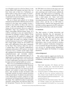
3DP medication label for BVI
           use of English words due to the low literacy levels   the 3DP labels were shown to the target users and
           among  elderly  BVI patients  and  those  who lost   it was also communicated that the labels were
           their  vision early  in  their  lives.  Furthermore,  as   only a prototype and would be more aesthetically
           tactile acuity is lower than the sense of vision ,   pleasing with improvements in technology with
                                                        [12]
           the words on the 3DP label could have been too      time. In addition, feedback could only be obtained
           complicated to be perceived by the sense of touch   from  a  small  sample  size.  Future  work could
           compared to simple tactile shapes.                  further  identify  the  perceptions  and  preferred
             The use of shapes and symbols for the dosing      formatting parameters of the 3DP label in a larger
           instructions and medication identifiers were received   patient  cohort, and the role of 3DP labels in
           positively by the target users, probably because it   complementarity with the main dispensing labels
           would be more intuitive for those who were less     and other auxiliary approaches for BVI patients to
           literate , and thus could address the challenge of   manage their medications could also be studied.
                 [10]
           literacy levels in our patients. However, a universal
           half-sphere  shape  was  preferred  over  different   5 Conclusion
           shapes  representing  different  dosage  forms,  as  it
           could be confusing to users and required them to    The label consists of dosing instructions and
           remember the meanings of many symbols. It was       medication  identifiers  that  are  represented  by
           also suggested that the symbols be enlarged and     shapes and symbols. In addition, several features
           more elevated so as to improve its user-friendliness   that  make  the  3DP  label  more  patient-centric
           for the blind. Our results were similar to another   and user-friendly  for BVI patients  have been
           study by Ramsamy-Iranah et al. , which suggested    identified.  With  future  advancements  in  3DP
                                        [40]
           that a larger height contrast for 3D symbols was    technologies,  there  is great potential  to produce
           more easily differentiated from other components    3DP labels in patients’ medication management,
           by  the  blind.  These  findings  reflect  the  need  for   so as to transform the last-mile delivery of health-
           a solution that is able to provide comprehensive    care services by enabling  patient  independence
           medication information to BVI patients, yet simple   and ownership against the backdrop of an aging
           in delivery. Such a solution would require trade-   population.
           offs, underpinned by harmony between information
           comprehensiveness and individual intuition.         Acknowledgement
           The  trade-offs  for  3DP  medication  labels  to  be   The authors thank the support provided by the
           implemented in clinical practice would be the size   Dialogue in the Dark (DiD) Singapore and School
           of the labels and the high initial costs of producing   of Pharmacy, University of Sydney.
           it, which would require a decision on its cost-benefit
           by target end-users and the health-care system.     References
             There were several limitations in this project. As
           this was a proof-of-concept project, the 3D printer   1.   World Health  Organization,  2019, Blindness and  Vision
           used was not a high-end  product. As such, the          Impairment.  Available  from: https://www.who.int/news-
           print resolution by the FFF was limited by nozzle       room/fact-sheets/detail/blindness-and-visual-impairment.
           diameter  and  resulted  in  higher  layer  thickness;   [Last accessed on 2020 Apr 28].
           hence, only elevations of some increments could     2.   American Foundation for the Blind, 2020, Facts and Figures
           be printed, and this also led to a poorer resolution    on Adults with  Vision  Loss. American  Foundation  for the
           of the printed objects. In addition, the deformation    Blind, Arlington County. Available from: http://www.afb.org/
           of the 3DP products occurred, which led to some         info/blindness-statistics/adults/facts-and-figures/235.  [Last
           components not being produced in alignment with         accessed on 2020 Apr 19].
           the design. This contributed at times to inadequate   3.   Zuckerman DM, 2020, Blind Adults in America: Their Lives
           separation among letters and between letters and        and Challenges. Available  from:  http://center4research.org/
           the background. However, the best variations of         wp-content/uploads/2010/05/blind02041.pdf. [Last accessed

           122                         International Journal of Bioprinting (2020)–Volume 6, Issue 2