Page 124 - IJB-6-2
P. 124
3DP medication label for BVI
           label.  Their preferences  for the parameters
           were combined to develop the initial  3DP label
           prototype, which was then shown to four target
           users to obtain their feedback and suggestions for
           improvement. These users were selected because
           of their close interactions with BVI patients
           or personal  experiences  as BVI persons.  They
           comprised  a geriatric  pharmacist,  an executive
           from the Dialogue in the Dark (DiD) Singapore ,
                                                        [35]
           and two visually-impaired persons who worked at
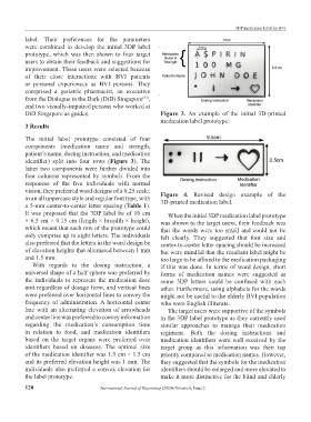
           DiD Singapore as guides.                            Figure  3. An example of the initial 3D-printed
                                                               medication label prototype.
           3 Results

           The  initial  label  prototype  consisted  of four
           components  (medication  name  and  strength,
           patient’s name, dosing instruction, and medication
           identifier)  split  into  four  rows  (Figure 3). The
           latter two components were further divided into
           four columns represented by symbols. From the
           responses  of  the  five  individuals  with  normal
           vision, they preferred word designs of a 0.25 scale,   Figure  4.  Revised  design example  of the
           in an all uppercase style and regular font type, with   3D-printed medication label.
           a 5-mm center-to-center letter spacing (Table 1).
           It was proposed that the 3DP label be of 10 cm        When the initial 3DP medication label prototype
           × 6.5 cm × 0.15 cm (length × breadth × height),     was shown to the target users, their feedback was
           which meant that each row of the prototype could    that the words were too small and could not be
           only comprise up to eight letters. The individuals   felt clearly.  They suggested that font size and
           also preferred that the letters in the word design be   center-to-center letter spacing should be increased
           of elevation heights that alternated between 1 mm   but were mindful that the resultant label might be
           and 1.5 mm.                                         too large to be affixed to the medication packaging
             With regards to the dosing instruction,  a        if this was done. In terms of word design, short
           universal shape of a half sphere was preferred by   forms of medication  names were suggested as
           the individuals to represent the medication dose    some  3DP letters  could  be  confused  with  each
           unit regardless of dosage form, and vertical lines   other. Furthermore, using alphabets for the words
           were preferred over horizontal lines to convey the   might not be useful to the elderly BVI population
           frequency of administration. A  horizontal center   who were English illiterate.
           line with an alternating elevation of arrowheads      The target users were supportive of the symbols
           and center line was preferred to convey information   in the 3DP label prototype as they currently used
           regarding  the  medication’s  consumption  time     similar  approaches to manage their  medication
           in  relation  to  food,  and  medication  identifiers   regimens.  Both  the  dosing  instructions  and
           based on the target organs were preferred over      medication identifiers were well received by the
           identifiers  based  on  diseases.  The  optimal  size   target group as this information was their top
           of the medication identifier was 1.5 cm × 1.5 cm    priority compared to medication names. However,
           and its preferred elevation height was 1 mm. The    they suggested that the symbols for the medication
           individuals also preferred a convex elevation for   identifiers should be enlarged and more elevated to
           the label prototype.                                make it more distinctive for the blind and elderly

           120                         International Journal of Bioprinting (2020)–Volume 6, Issue 2

