
Page 43 - AC-1-2
P. 43
Arts & Communication Correlations between artworks and contacts
convenience. A Pandas DataFrame is a structure that
contains two-dimensional data and its corresponding
labels . DataFrames are widely used in data science,
[16]
machine learning, scientific computing, and many other
data-intensive fields. DataFrames share some similarities
with SQL tables and spreadsheets, but in many cases,
DataFrames are faster, easier to use, and more powerful
than tables or spreadsheets because they are an integral
part of the Python ecosystem. Consequently, the ingestion
of the data provided us with the convenience of not having
to access the database and more freedom to transform the
data. We parsed 10,477 rows with entities and valid dates.
At this point, we also decided to create a DataFrame for
the artworks, which contained 35,886 rows.
We decided to use two-dimensional grid visualization,
displayed as a grey and white chart, where the colored
blocks represent a reference to an artwork or a personal
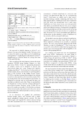
Figure 1. The record retrieved from the “Narrative” table from the MySQL contact. We tried using Python’s Matplotlib and Plotly
database includes a reference to Carles Casagemas, which is retrieved [17,18]
from the “Link” table. The reference is linked by a “linkId” attribute with libraries to create the visualization , but Picasso was a
a unique value. very prolific artist, which translated into having many data
points at once and creating issues with the legibility of the
We exported the MySQL database to SQLite , as it output of the graphing libraries.
[12]
allowed us to query the database locally. Then proceeded As a solution, we created our own two-dimensional
to extract the entities using Python and its BeautifulSoup grid using HTML. Furthermore, we used Yattag to
[13]
[14]
parsing library (employing the lxml parser for speed) . programmatically generate the visualizations. Yattag is a
BeautifulSoup is a Python library for pulling data from Python library for generating HTML or XML . Yattag
[19]
HTML and XML files. will close HTML tags as one of its features, and we found
First, we analyzed the term frequency-inverse document it practical and readable to generate dynamic HTML with
frequency (TF-IDF) using Gensim. Gensim is a free, this library compared to writing static HTML. Using
open-source Python library for representing documents HTML meant that our visualization could be rendered in a
as semantic vectors and is designed to process raw, web browser and stretched horizontally and vertically.
unstructured plain text using unsupervised machine We also focused on the time period from January 1900
learning algorithms . We focused on the keywords and to May 1904 (which overlaps with Picasso’s Blue period)
[15]
entities (people, places, and artworks) in each biographical and restricted the places and persons that were parsed. At
entry in the narrative of the Online Picasso Project. this point, we also added the artwork titles, which were only
TF-IDF is a statistical measure that evaluates how relevant referenced by their unique identifiers in the Online Picasso
a word is to a document in a collection of documents. More Project. Artworks can have long titles, which we solved
specifically, from a list of relationships/friends/dealers, we by displaying this metadata as a tooltip. Figure 2 shows a
attempted to examine who are mentioned the most and screenshot of the two-dimensional grid visualization for
how they are related to each other. Then, we analyzed how the keywords and entities extracted in each month of the
the frequencies in those mentions correlate with specific year 1901.
years/seasons/months. However, using TF-IDF did not
give us the results we were after: It did provide us a measure 3. Results
of how relevant each of the entities was to the other entries Our goal was to determine the correlation between certain
in the narrative, but it did not provide us with any evidence individuals in Picasso’s life and events in his life, specifically
of the correlations.
how friends, lovers, artists, and dealers he had contact with
As an alternative, we graphed the correlations might have influenced some of the known periods scholars
between people, places, and artworks with a single- have used to divide his artistic career. As a sample, we chose
month granularity during specific periods. We used the entities as individuals listed in Table 1 and verified if, as
Python again and ingested the entities extracted along it has been reported in several Picasso biographies, those
with their associated dates into a Pandas DataFrame for individuals are related to specific time periods.
Volume 1 Issue 2 (2023) 3 https://doi.org/10.36922/ac.1004