
Page 96 - OR-1-1
P. 96
A A
B C D
E
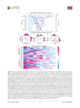
Figure 5. XGBoost model explanation by the SHAP method. (A) This combined figure includes a SHAP summary bar plot (left) and a SHAP bee swarm plot
(right) to explain the XGBoost model’s predictions of 2-year tumor recurrence. In the bar plot, the Y-axis lists the top 10 features ranked by their mean SHAP
values (quantifying global importance), while the top X-axis shows these values ranging from 0.0 to 0.6. Tumor number is the most influential feature (SHAP =
0.6), followed by PT, platelet count, and inhibition ratio for ICC organoids. The bee swarm plot (right) visualizes individual SHAP contributions for each feature:
The bottom X-axis represents SHAP values (left = lowers risk, right = increases risk), and the Y-axis aligns with the feature list. Each dot corresponds to a patient,
colored by the normalized feature value (red = high, blue = low). Vertical stacking reflects patient density. For example, high tumor numbers (red dots clustered on
the right) strongly associate with recurrence risk, while low inhibition ratio (blue dots) correlates with low risk (leftward SHAP values). (B-D) SHAP dependence
plot of inhibition ratio, tumor number, and tumor size. Take Figure 5B as an example, the X-axis represents the inhibition ratio (0 – 50%) derived from patient-
derived organoid (PDO)-based drug response assays, while the Y-axis shows the corresponding SHAP values (range: −0.1 – 0.2). Each dot corresponds to a patient,
colored by recurrence status (blue = non-recurrence, red = recurrence). A LOESS line (gray) reveals a negative trend: Lower inhibition ratios correlate with higher
SHAP values, which represent increased recurrence risk. The peak distributions (top and right margins) highlight that non-recurrence cases (blue peaks) cluster
at higher inhibition ratios (>30%), whereas recurrent cases (red peaks) dominate at lower ratios (<20%). Notably, in Figure 5D (tumor size), larger tumors (X-axis
>5 cm) generally associate with higher SHAP values, yet substantial overlap exists between recurrence groups, implying tumor size alone is insufficient to stratify
risk. (E) The SHAP value heatmap analyzing the top 10 features across 20 representative patients (10 recurrence and 10 non-recurrence). Each row corresponds to
an individual patient, while columns represent features ranked by global importance (identical to Figure 5A). The color gradient spans from blue (negative SHAP
values, reducing recurrence risk) to red (positive SHAP values, enhancing risk). Recurrent cases exhibit dominant red hues for high-impact features like tumor
number, PT, and inhibition ratio, indicating these factors collectively drive their poor prognosis. In contrast, non-recurrent patients show the protective blue
patterns, particularly for albumin and low tumor number. This heatmap underscores the clinical value of SHAP analysis in pinpointing personalized risk drivers:
for instance, sample 34’s high-risk profile is dominated by elevated tumor number and lower inhibition ration. Such granular visualization aids in stratifying
patients for targeted interventions based on their unique clinical pathological features and PDOs-based drug sensitivity test results.
Abbreviations: XGBoost: eXtreme Gradient Boosting; ICC: Intrahepatic cholangiocarcinoma; PT: Prothrombin time.
Volume 1 Issue 1 (2025) 9 doi: 10.36922/or.8571