
Page 78 - GHES-3-2
P. 78
Global Health Economics and
Sustainability
Climate change and quality of life
low unemployment rate (3.947%), suggesting a strong and production index, by visualizing the overlap and trends
diverse economy that keeps unemployment low despite of both variables over the years. Inflation, the consumer
significant emissions. Middle East & North Africa presents price (annual %), is the % of change in the price of a
a contrasting scenario. Although methane emissions are basket of goods and services consumed by households. It
the lowest among the regions, unemployment is the highest is referred to as the consumer price index and is a well-
(10.537%). This discrepancy highlights economic over- known indicator of inflation. The food production index
reliance on specific sectors and the lack of diversification. In measures the changes each year in the production of
summary, contrary to the expectation that unemployment edible food, relative to the base year 2014 – 2016. While
rates increase with methane emissions, there appears to the consumer price index relates to food consumption, the
be no direct correlation between methane emissions and food production index relates to food production. Based on
unemployment rates; regions with higher emissions do not the figure, in 2011, where there is a spike in the inflation of
consistently have higher unemployment rates. However, consumer prices, there is a decrease in the food production
there is potential for national policies that should target index, which can be due to the result of the pressure from
unemployment along with sustainability goals. inflation. A drop in inflation leading to a decline in food
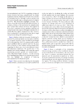
Figure 6 displays a dual-axis line graph illustrating the production indicates that lower inflation is associated with
trends of CO emissions (metric tons per capita) in the blue reduced economic activity, which can be construed as
2
line, alongside secondary school enrollment percentages adverse impacts on agricultural investments and outputs.
(net) in the purple line. Both CO emissions and secondary Thus, policymakers need to consider how inflation can
2
school enrollment show an upward trend over the years, impact sectors, such as agriculture, particularly with the
with an increase in both metrics starting around 2014, growing demand brought about by population growth and
suggesting that there was a rise in environmental impact economic development.
and educational attainment. The parallel rise in CO Figure 8 shows a scatterplot of the relationship
2
emissions and school enrollment could imply that regions between average secondary school enrollment rates and
experiencing economic growth and industrialization – access to electricity (% of population). The chart shows
which often lead to higher emissions – are also investing that there is a positive association between the two
in or benefiting from enhanced educational opportunities. measures and the association is significant (p <0.01).
This may highlight the complexity of balancing As access to electricity increases, the average secondary
environmental and developmental goals. school enrollment rate also significantly increases, in all
Figure 7 depicts an area chart showing the relationship the regions. The strong correlation between increased
between inflation, consumer price (annual %) and the food access to electricity and higher school enrollment rates
Figure 6. Dual-axis line graph of CO emissions (metric tons per capita) and secondary school enrollment (% net)
2
Volume 3 Issue 2 (2025) 70 https://doi.org/10.36922/ghes.5018