
Page 152 - AC-3-2
P. 152
Arts & Communication Strategies for handicraft video cognition
identification of viewers. These colors were consistently video by stimulating recall and reflection. The summary
34
applied throughout the schematic visual elements of the also encompassed a preview of the next video in the series
videos, ensuring overall visual unity and harmony. A flat to spark curiosity and anticipation in viewers. The previews
style was utilized for the design of visual elements: elements were designed to resemble trailers of television series. This
were extracted from Guangcai porcelain patterns and the approach effectively encouraged continued engagement,
author’s subjective understanding and perception of the enhanced the coherence of the video series, and increased
Guangcai porcelain culture was incorporated to create a viewer participation.
series of stylized visual patterns and elements. The refined construction of visual language was based
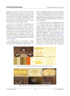
In addition, a mind map-like visual language was on the strategy of enhancing the cultural expressiveness
employed for content previews to enable viewers to of visual elements at the sensory experience level. This
quickly grasp the overall structure and core information strategy facilitated the effective transmission of the
presented in the videos. Pause screens were inserted at key cultural connotations of Guangcai porcelain and attracted
34
turning points to signal upcoming content changes and the attention of the younger generation. The cover
give viewers some time to reflect and process information. design integrated the imagery of Guangcai porcelain with
These transition pages optimized the narrative flow and handwritten calligraphy to convey the unique cultural
strengthened cognitive scaffolding. Thus, they aided charm and artistic value of this craft form (Figure 8).
viewers in understanding and absorbing the complex Backgrounds and texts were integrated to introduce scrolls,
techniques or important cultural information presented in brushes, and porcelain shapes for subtitle designs. Thus,
the videos (Figure 7). clear visual symbols were established for different content
segments to achieve precise information transmission
A knowledge summary was provided in question and increase visual appeal. Moreover, lightweight design
format at the end of every video, to allow viewers to review elements such as frosted glass effects were cleverly
the content and to reinforce the cognitive effects of the incorporated to endow the subtitles with an elegant and
Figure 6. Colors and graphic designs utilized for the short videos. Image created by the authors.
Figure 7. Visual designs employed in the short videos. Image created by the authors.
Volume 3 Issue 2 (2025) 12 doi: 10.36922/ac.3252